


hand-drawn animations for new product release announcements on social (reels for algorithmic engagement)
March 2020, Vikre Distillery approached me to lead and create a set of labels for a new addition to their product line, the Bar Master's Series.
In initial talks, Vikre made it clear they wanted the design to reflect their values of thoughtful craft, willingness to experiment, and approachability (and a bit of their quirk).
Knowing our values align, they wanted to give me as much artistic freedom as I wanted, trusting that whatever I create would embody those same values.
Though as a brand-focused designer, I needed to set some boundaries to the sandbox.
Objectives
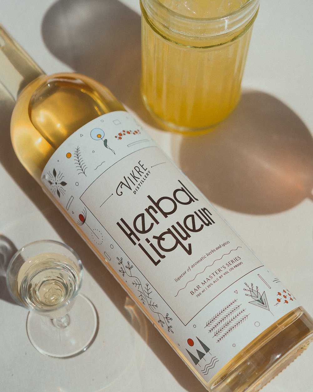
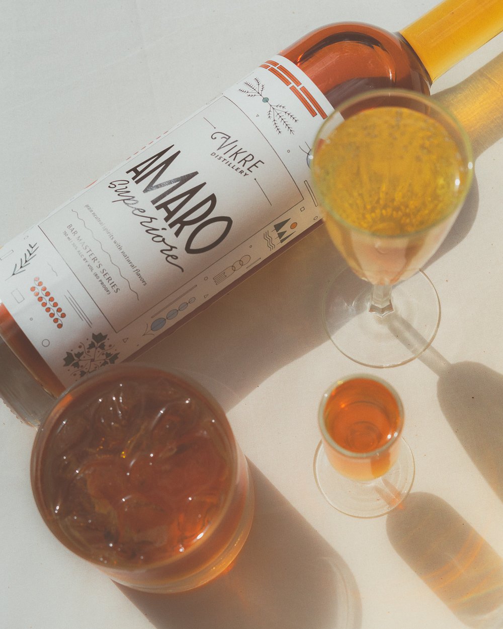
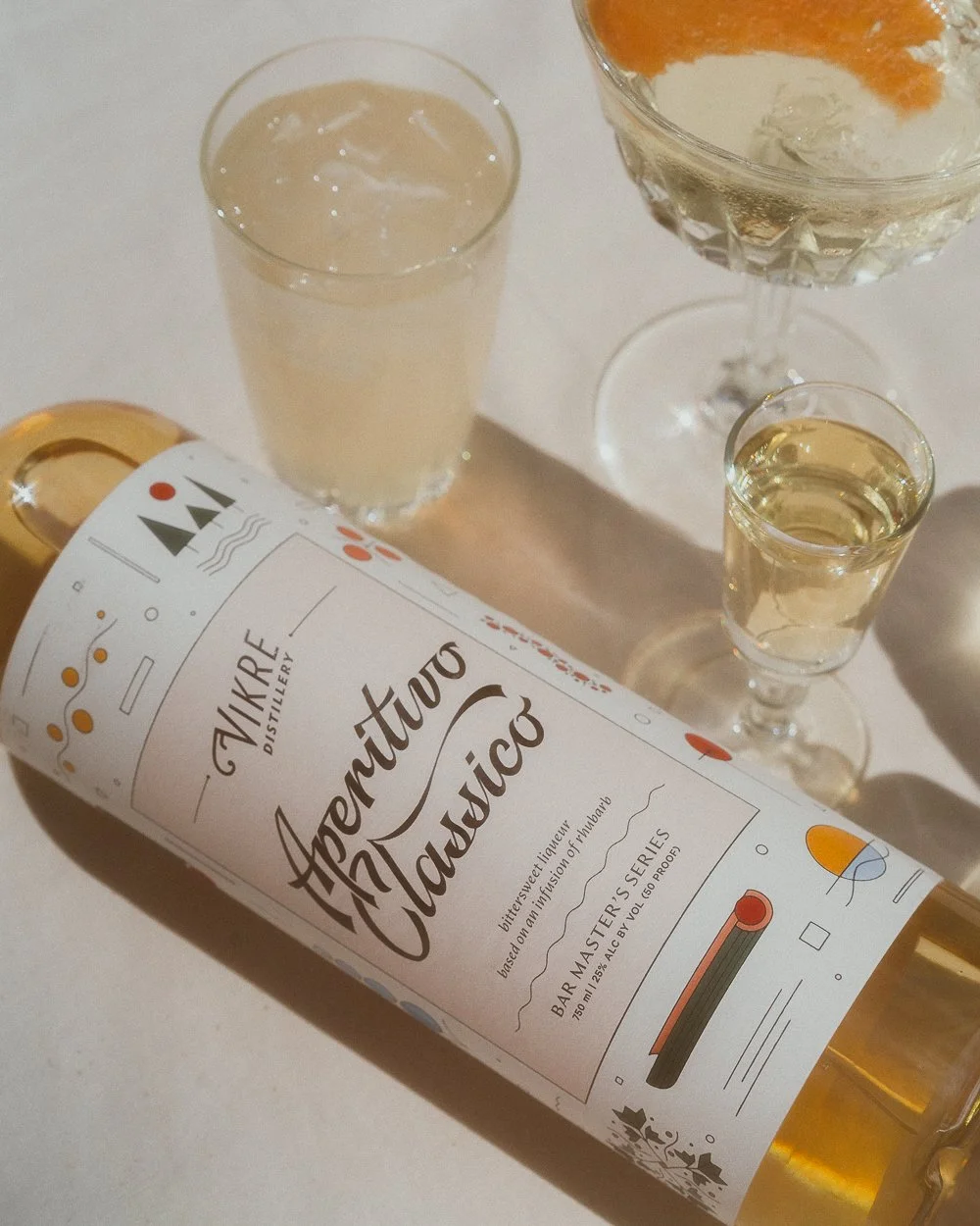
to create a set of labels, each unique to reflect the slow-crafted essence of their own flavor profiles but recognizable as a cohesive family, and modular enough that the set could grow to include more liqueurs as Vikre continues to experiment and create
reference the Italian heritage of the liqueurs, filtered through the lens of their Nordic creator in northern Minnesota

Process
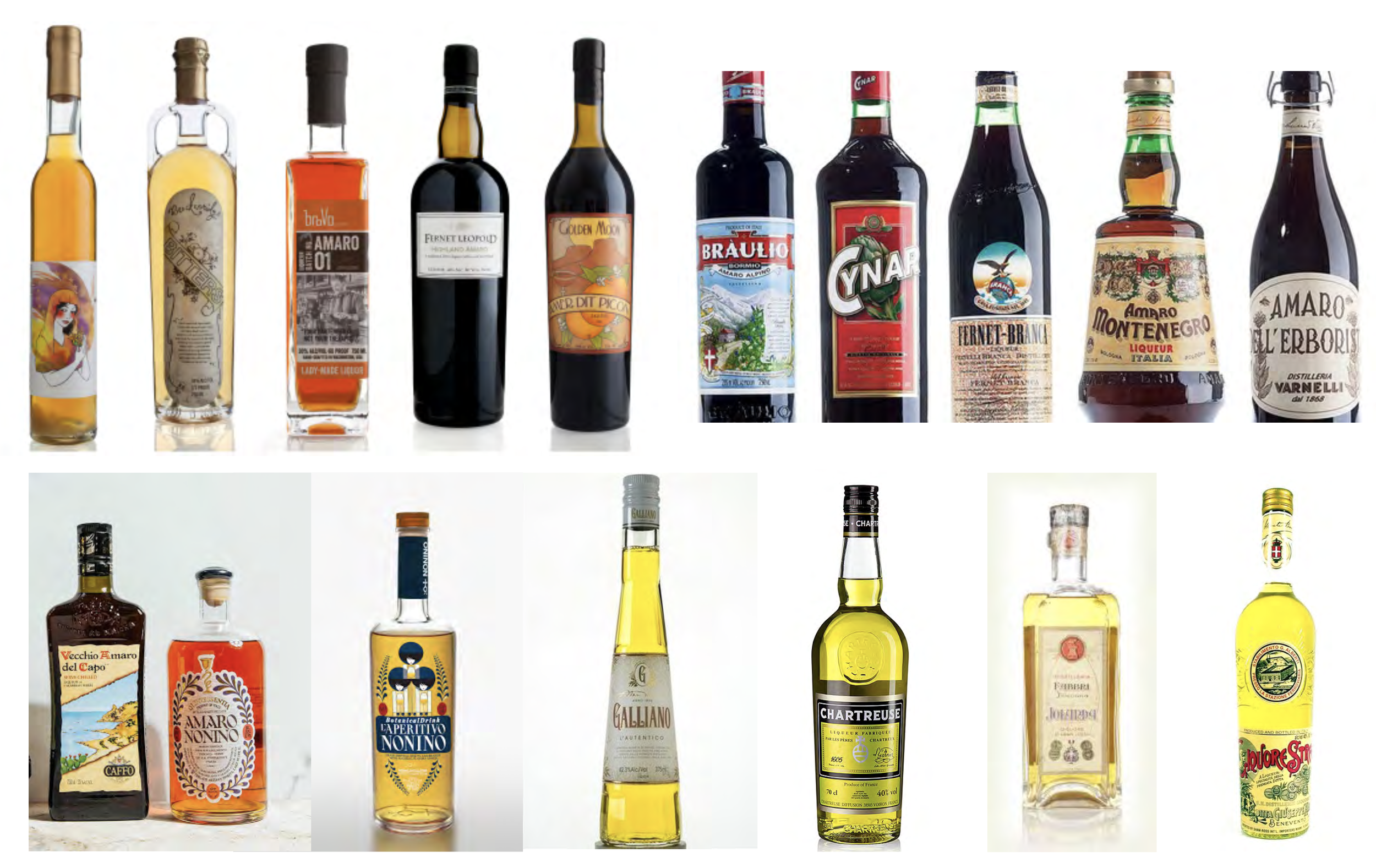
Most liqueur bottles on the shelves are legacy brands with rich histories of traditional and secret recipes, reserved for fancy cocktail bars and glamorous late nights.
Whereas I wanted these bottles to reflect the feeling of sitting on a cafe patio mid afternoon on a breezy summer's day. I hoped to create a design to stand out on the shelf as a welcoming hello while holding its own amongst the established, elevated brands.
I chose to do this by hand-drawing Italian-signage inspired titles supported by Artifex Hand & Calibre— both typefaces with history tying back to Italian influence or reference.
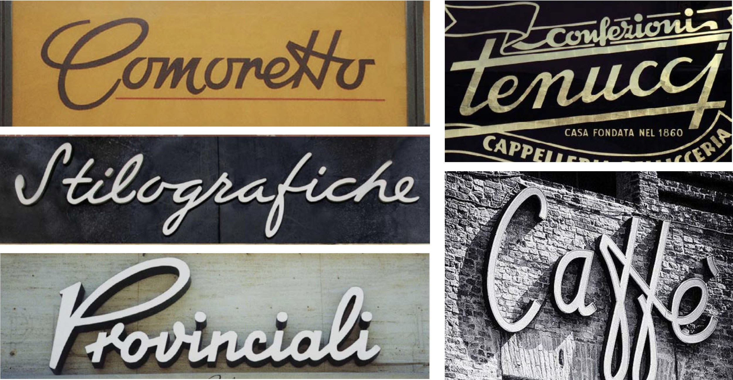
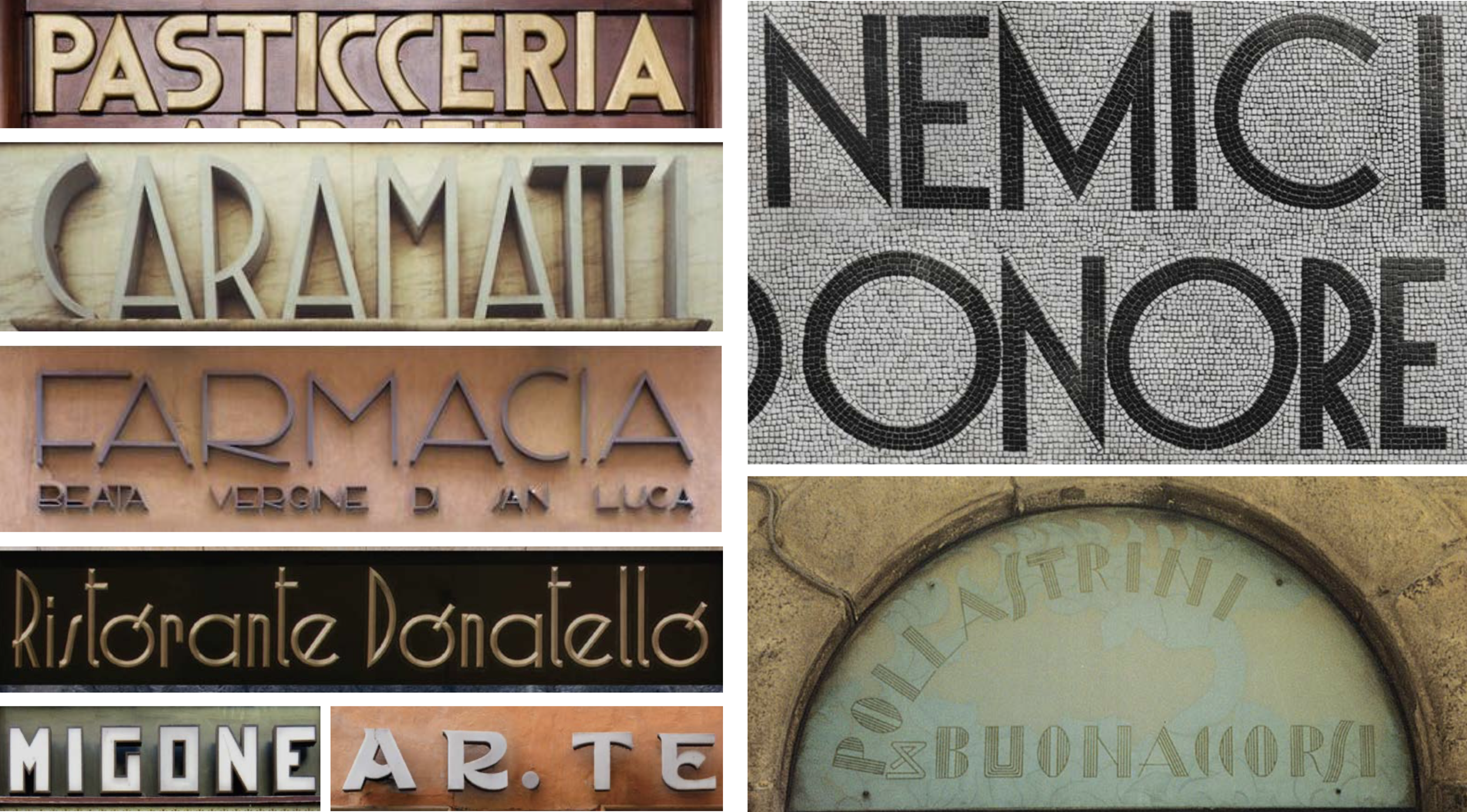
To tie it back to Minnesota and Emily Vikre's Scandinavian roots, I surrounded the type with abstract, folk-art inspired illustrations representing each ingredient in the recipes.
I made the illustrations abstract enough so that if they needed to change the recipe, the illustration wouldn't be a liability to remove on the label as well (and to give the viewer a fun guessing game).

Problem solving
The original design proposed was to be the text area printed ivory with the illustrations surrounding printed on clear vinyl– to be heat sealed to the glass bottle utilizing a near perfect mechanical production.
But with covid-related supply delays and budget changes, we pivoted to a solution where the Vikre employees could hand-apply the labels in house, as manually applying clear vinyl would be problematic and bubbly. So we moved to printing the entire art area on a subtly textured ivory paper, to minimize the appearance of the inevitable imperfections that come with hand-application.
The matte paper solution turned out to be more in alignment with Vikre’s values to minimize their environmental footprint than a shiny plastic label, as well as the visual associations involved.
As one the few projects I've worked on where I've been able to lead creative as well as executing cross-discipline from start to finish, I'm so incredibly grateful that Vikre entrusted this project to me and honored that I was able to provide a set of designs equally as intentional and hand-crafted as the contents within.
